BRAND IDENTITY FOR AN ART SCHOOL
LOCATION
YEAR
STATUS
YEAR
STATUS
Venice, Italy
2016
Completed
2016
Completed
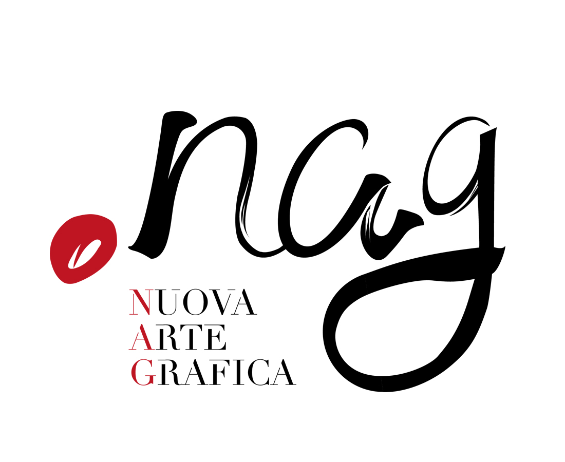
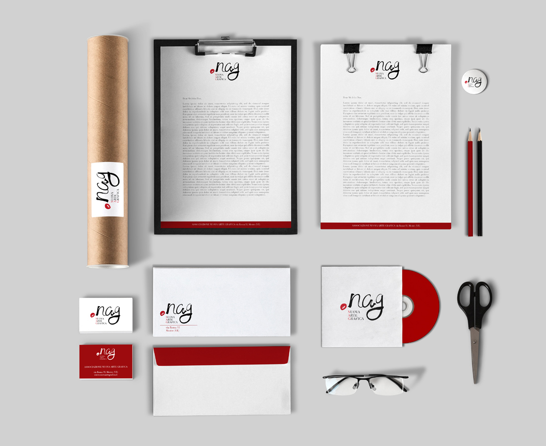
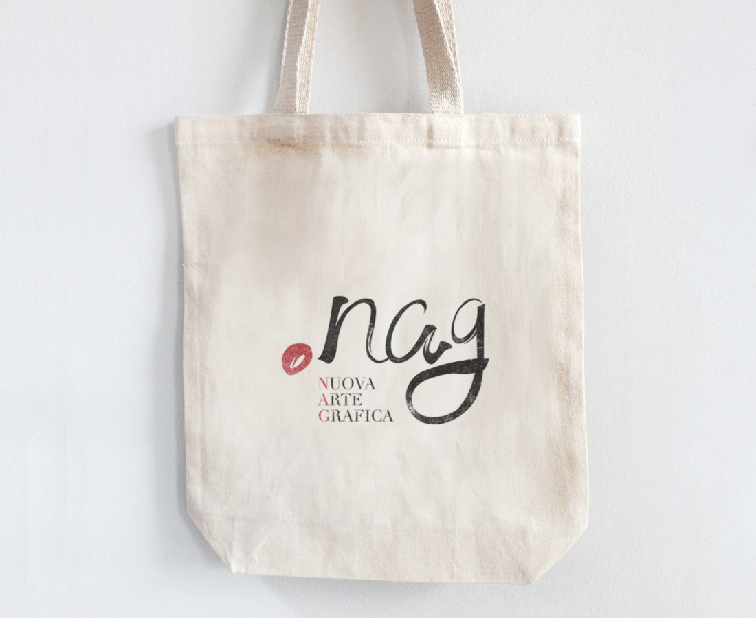
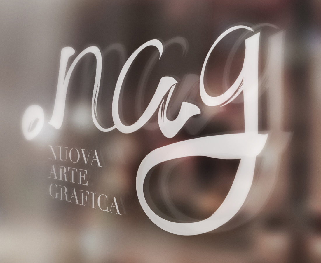
We took care of the redesign of the logo and all the brand identity for the art school “Nuova Arte Grafica”.
Since the client wanted to get a more fresh identity, the old logo has been completely revolutioned.
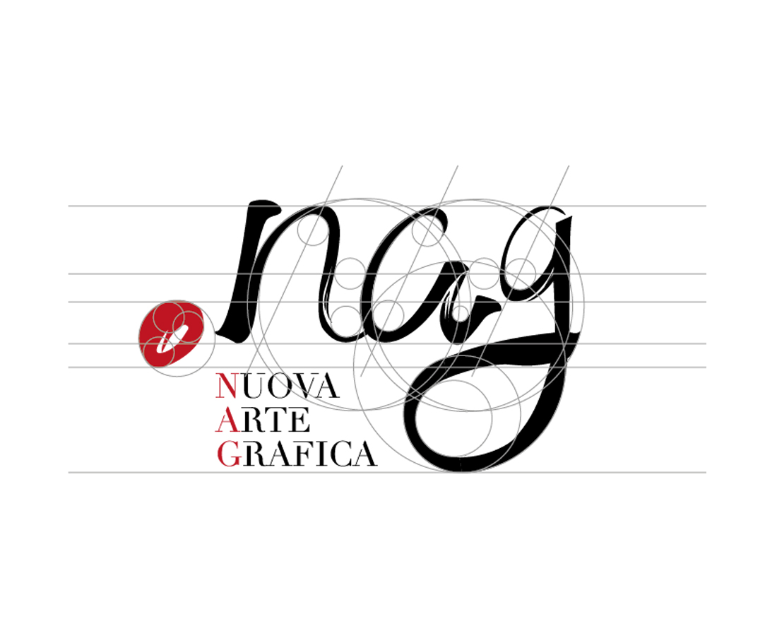
The name of the school, “nag” has been treated with a freehand style, as if it had been written with a brush, while a custom font, based on Didot has been created for the subheading “nuova arte grafica”.
The dot on the left gives strenght to the logo, recalling somehow a spot of color on a color palette.